


Interactive heat maps for a dynamic market overview
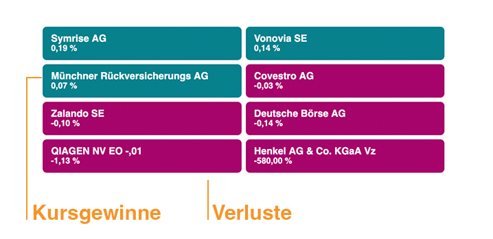
The Heat Map is the ideal tool to capture at a glance how an index develops – clear, intuitive and real-time. By colour coding visualizes the widget course movements within a defined segment. How to Winners and losers immediately visible – without users having to search individual course patterns.
The heat map represents all values present next to each other – as tiles which are color-coloured proportional to performance. This allows a visual weighting at a glance. Green stands for price gains, red for losses.
The widget is mobile-optimized, slim in design and fits seamlessly into your web portal or application. Thanks to automatic updating, the data is always up to date. You select the index or market segment – we take care of the technical implementation and integration.
Ideal for stock exchange portals, financial media or information pages that want to provide their users with fast market trends and developments.
